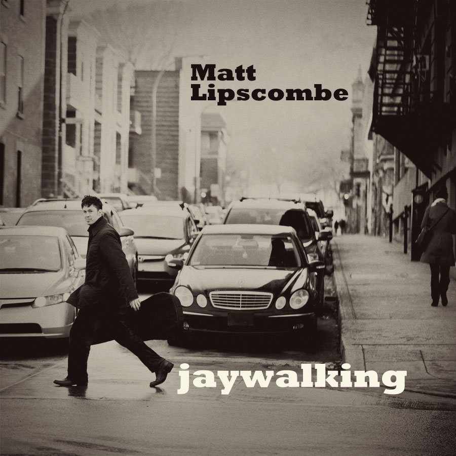
 Last week I went out with my husband to shoot his album artwork for a new solo acoustic album he will be releasing in April at the Casa de Popolo. I had this idea of using the corner of St-Laurent Boulevard and Duluth, but the funny thing is that I was aiming at capturing the friperie on the corner including the street lamp and the image was just not really happening the way I had pictured it. Then I looked up Duluth, from the street corner where I was standing and I saw the slick of the pavement with the hint of Mont Royal in the back and the sunlight kind of streaking in from behind and I immediately changed the concept. No more traffic light, just the crossing and on the last shot of Matt crossing the street about 20 times, we got the shot! I already knew in my head at that point that I was shooting for a Bob Dylan style cover and I knew I wanted it in Black and White. It goes to show how an initial idea is not always the one you will end up with in the end, I’m so glad that it metamorphosed into this, which is infinitely better. I love what I do!

Vivian Doan Montreal Natural Light Portrait Photographer
Gorgeous Natural Light Portrait Photography
|
|
|
